Contributed by Jeremy Hartley
CDF Newsletter – August 2020 Article
Subscribe to the Newsletter
In open source terms Jenkins is a mature project with it’s 16th birthday now in sight. Jenkins is an incredibly successful project with about 282,000 Masters calling home in June 2020, and with a total of about 39 millions jobs defined on these Masters. It would by no means be a stretch to say that Jenkins is the most successful DevOps product out there.
One of the areas in which Jenkins is showing its age however is in the UI. It doesn’t have the fresh and modern look that you would expect from a product in 2020. First time CI/CD users are starting to look to other products, since the first impression of Jenkins isn’t a good one. This is such a shame since there is so much power in Jenkins, which isn’t immediately visible at first glance. This is a product with 1700 plugins with hardly any job in the software delivery domain which it can not do.
The good news is that regular Jenkins users may have noticed that the Jenkins UI is slowly changing. An example of a new header design for Jenkins is shown in the image below.
Rather than taking a boil the ocean approach and rewriting the Jenkins UI from scratch, we are taking an iterative approach in which we are gradually refreshing the Jenkins UI. This approach will make our product look fresh and modern, without changing the way that people are accustomed to work with Jenkins or require plugins to be rewritten to render properly in the new Jenkins UI. At a future point we will be looking into making deeper changes to the UI and also the overall UX.
An example of some recently completed work
The animation above shows the Jenkins Plugin Update Center, both before the revamp and afterwards. The new design shows off the recently completed work on tabs and tables, which have provided a cleaner and easier to read design. You will also notice a number previously updated elements:
- Header Bar
- Bread Crumbs (directly beneath the header bar)
- Revised Typography
- Buttons
Note: The changes to the tabs and tables is available in the weekly release 2.248. They will be more generally available in the Jenkins LTS planned for release in September 2020.
The animation above shows the Manage Jenkins page. Again you can see both the before and the after. The main focus here is the new grid view,
A short video is available which shows some more information about the methodology used and the progress of the UI overhaul.
How did we get here?
Late last year (2019) a group of people in the open source, as well as at CloudBees, got together and started planning how we could best overhaul the Jenkins UI. Out of these discussions the Jenkins UX Special Interest Group (SIG) was formed. A key decision early on was that the initial focus would not be to create a whole new user experience. Blue Ocean had attempted to create a whole new UI. Blue Ocean was successful in a fairly narrow sense, namely it helped better visualize pipeline execution, but it had failed to meet its broader goals of creating a whole new UI for Jenkins. The key learnings from Blue Ocean was that if you don’t have a plan from the get go for how to deal with the extensibility, which the 1700 or so plugins provide, then you will fail. So the key decision which the Jenkins UX SIG made was to take a gradual approach focusing on modernizing the look and feel of the Jenkins UI. This would primarily be a CSS-based approach, though opportunistically pieces of technical debt would be resolved along the way.
Key Deliverables
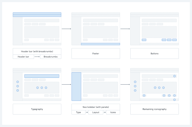
The project was initiated towards the end of 2019, but this quarter consisted mainly of ramping up and making the first small changes as a proof of concept. At the beginning of 2020 the real work started. The work during the first half of the year consisted of:
- New Header Design and Breadcrumbs
- Updated Page Footer
- Updated Buttons
- Improved Typography
- Updated Sidebar & Panels
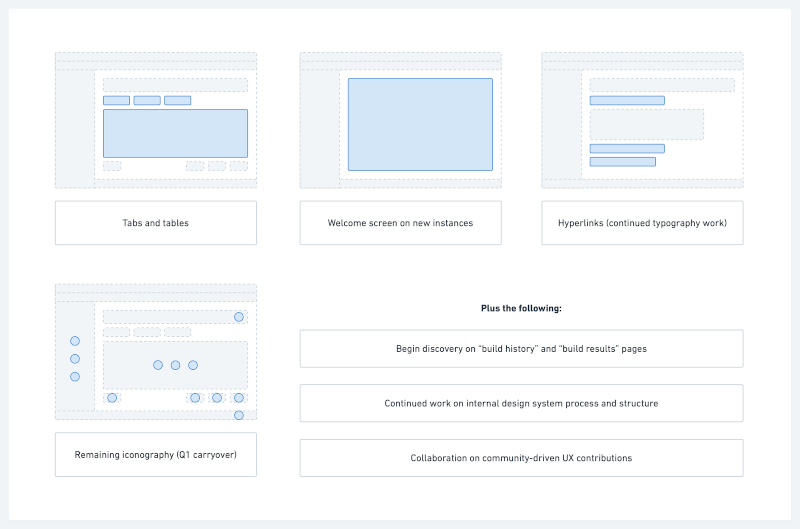
Over the summer of 2020 we will be continuing work on the following areas:
- Iconography Overhaul
- Tabs & Tables
- Welcome Screen on New Instances
- Updated Hyperlink Style
- Replace tables with divs
Delivery
The new UI is being delivered iteratively. Jenkins is a complex project with a 1700+ plugin ecosystem, which makes it difficult to make big changes quickly. This means that there won’t be a big reveal but instead you will see Jenkins changing feature by feature. If you want to be the first to see these changes, then check out the weekly releases of Jenkins. Whenever we release a new LTS of Jenkins, the new features that have been delivered during this period will be made generally available.
How to Help
CloudBees is driving these exciting & significant UI updates to Jenkins. They have kindly dedicated an extremely talented full time engineer to the project, Felix Queiruga. We also have access to an excellent superb UI/UX designer, Joe Brueggen from CloudBees. I have been helping out with the product management. Three people are not enough to make this project a success however. We have been blessed with some great contributions from the open source community, but as this project picks up momentum we are ever in need of more help. If you would like to help then please don’t be shy. You can find out more about how to help by joining the bi-weekly Jenkins UX SIG meeting, which takes place every second Wednesday at 1600 UTC or by joining the project Gitter room everybody is very welcoming.
Some Credits
I would like to name a few people that have made particularly helpful contributions to the project: Tim Jacomb, Ulli Hafner, Josh Soref, Romén Rodríguez-Gil and Daniel Beck.
I would also like to thank Oleg Nenashev, Mark Waite and Tracy Miranda for their help with setting up the Jenkins UX SIG. They were also instrumental in organizing the Jenkins UI Hackfest back at the end of May 2020, in which 53 participants made hundreds of contributions towards the Jenkins UI. One of the stand out deliverables of the Hackfest was the new Dark Theme which Tim Jacomb describes in more detail in this article.


